Today I came across this map/diagram:
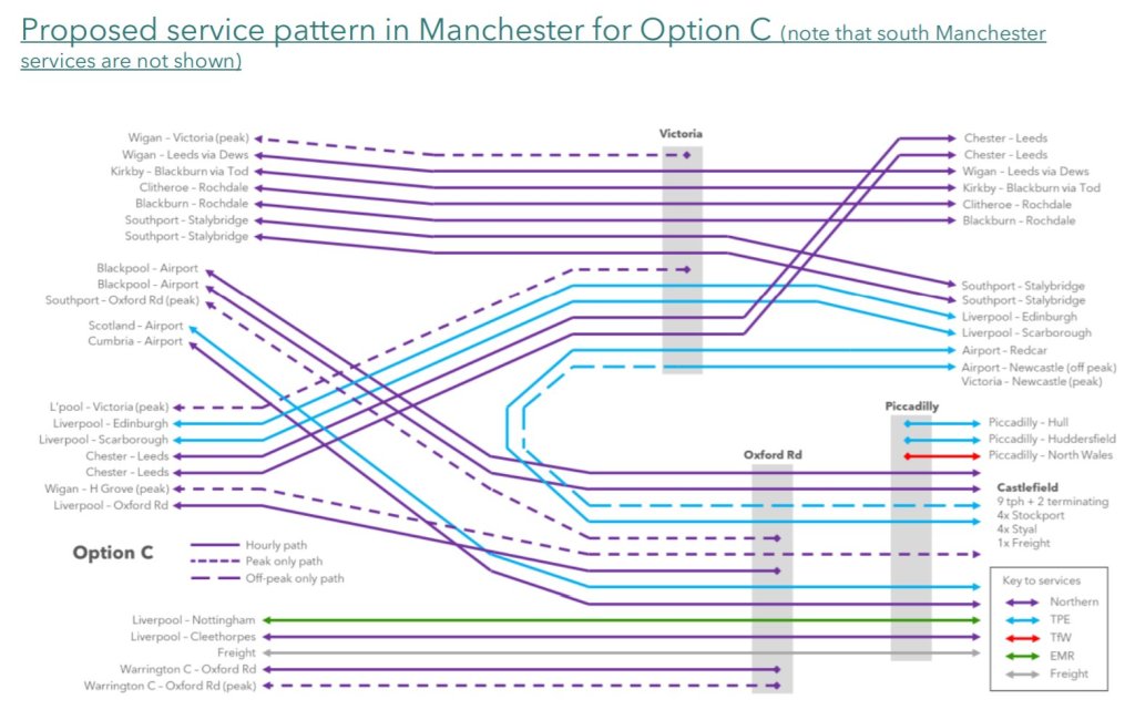
It’s shows train services which pass through Manchester Victoria station and the Castlefield Corridor – key pieces of rail infrastructure in Manchester which get congested easily and are often the source of lengthy delays to rail services all over the North of England.
It isn’t actually showing the services patterns as they exist now, but a proposed ‘solution’ to the congestion problems. ‘Option C’ is one of three options to reduce the number of trains using the Castlefield Corridor and (hopefully) enable better running of the regions’ trains.

I’ve illustrated option C here as it’s my favourite solution out of the three proposed. However, what is not my favourite is the diagram itself. Obviously it is not meant to bear any resemblance to real life track plans, and is intended to be a clear illustration of what is a rather complicated network. But, it does that really badly. It actually made me quite annoyed looking at it. Why are there so many places where lines cross over each other unnecessarily? (see Blackpool-Airport trains over Redcar/Newcastle-Airport trains for the worst offending example). Why are origin and destination listed on both (or even worse, only one) ends of the line instead of origin at one end and destination at the other? Why aren’t origins and destinations, and train operators (toc’s) grouped together as best as they can be?
Quite frankly I think this diagram is a masterpiece of terrible design. I’m sure they had their reasons for some of the choices (like keeping services which follow the same route together), but some are seriously unforgivable (like the aforementioned crossing over of Airport trains) and make the diagram harder to read than it should be.
So, accepting that my degree gives me the authority to do so, I cracked out the felt tips and had a go at redesigning it.
First off, a version which eliminated any crossing over of lines.

Beautiful. But sadly just as upsetting as the original. Origins and destinations are all over the place, toc’s aren’t grouped as best as they could be, and it doesn’t make intuitive sense for, for example, Liverpool services to be shown above the Scotland ones (especially because there are still other Liverpool ones below). Basically, this diagram is equally confusing and not the final product I’m aiming for.
The actual better version is this:

Minimal unnecessary crossed lines. Origin/destination listed more simply. Toc’s grouped together where possible (looking at all those TPE services). Groupings by line maintained and groupings by destination – for the most part – improved (all those airport services). I also split the Newcastle-Airport service into two, just to make it extra clear that it terminates in Victoria at Peak times. It’s too easy to miss that important change on the original. Overall a much nicer looking and more legible version than the original.
I did have to make some sacrifices, a notable example being that Chester-Leeds services now don’t appear next to the Wigan-Leeds service. I still think it’s worth it to remove all those crossed lines near Victoria.
Transport map design is important. There’s entire books about it, and it can materially affect how people use transit systems. Making these sorts of diagrams as simple and legible as possible is an important task. Like any map making it will involve making some sacrifices and prioritising certain aspects over others. By drawing two alternatives, I hope to have illustrated that point, and shown how such choices can seriously impact design and usability. Neither of diagrams I drew are perfect, and my ‘better’ one only represents what I believe to be the neatest presentation for the desired use-case.
In any case, I think the original designers made some very clear wrong choices here, and I’m a little disappointed that someone let them slip through the cracks for a Government led public consultation.
Take care over your maps and diagrams; they really do matter!
If you enjoyed those diagrams then here’s a little extra joy; the original diagram for existing (or at least pre-covid) service patterns vs my quick sketch following the same layout/rules as the one for option C. As I was uploading this I noticed I’d made a mistake on my version and included a crossing over of lines which I don’t think is strictly necessary. See if you can spot it.


